Key Takeaways:
Adding color outdoors does not mean abandoning a timeless or luxurious look. When it is used intentionally, color can elevate the entire space.
— Start with nature. Blues and greens feel timeless because they already exist in water, plants, and the surrounding environment.
— Use color strategically. Outdoor spaces have fewer layers than interiors, so placement matters more than quantity.
— Limit permanent commitments. Bold color works best in areas that are easy to update, like tile accents and soft furnishings.
— Let personality lead. Color is often the element that turns a space from neutral to transportive when it reflects how you live.
How to Add Color to Your Exterior Palette
For a long time, most exterior spaces have relied on neutral palettes. Warm whites, beiges, grays, and natural stone have been the standard. And there is a good reason for that.
When you are investing in hardscape, tile, stone, and exterior finishes, you do not want to take a risk on something you cannot easily replace. These materials are permanent, and choosing something overly bold can feel intimidating.
But that is starting to change.
Over the last couple of years, the biggest shifts have been happening in interiors. There has been a clear return to full color. Richer tones, more personality, and less fear around using color. Now, we are finally starting to see that shift show up in outdoor spaces as well.
Before you keep reading for tips on incorporating color into your exterior, book a free design consultation call with our team using the button below. We’ll talk about your project, what you want for your future yard, and provide you wiht a free quote. Click the button below to book today.
Why Color Is Coming Back in Exterior Design
Exterior design is often informed by interior design. Even for designers, the exterior is usually a reflection of what is happening inside the home. Ideally, the two spaces should feel cohesive.
A lot of what we are seeing now is driven by that interior influence. But beyond that, color represents something bigger right now. It represents a return to authenticity and personality.
There is a real push to make spaces feel like an accurate reflection of who you are, whether that space is interior or exterior.
The all-neutral aesthetic is very universal. It is clean and calming, but it is also general. It does not necessarily have a strong point of view. Color, on the other hand, is personal. Everyone responds to it differently, and everyone has their own preferences.
How to Add Color Outdoors Without Overwhelming the Space
Outdoor spaces do not have the same opportunities for color that interiors do. You do not have as many accessories like you would in a living room, dining room, or bedroom.
Because of that, color needs to be used very strategically outdoors. The goal is never for it to feel overwhelming. Instead, it should feel intentional and balanced.
A lot of clients express fear around using color. They worry about picking something they will regret or something they will end up hating after a short period of time. That concern is completely understandable.
The key is knowing where color works best and where it makes sense to stay neutral.
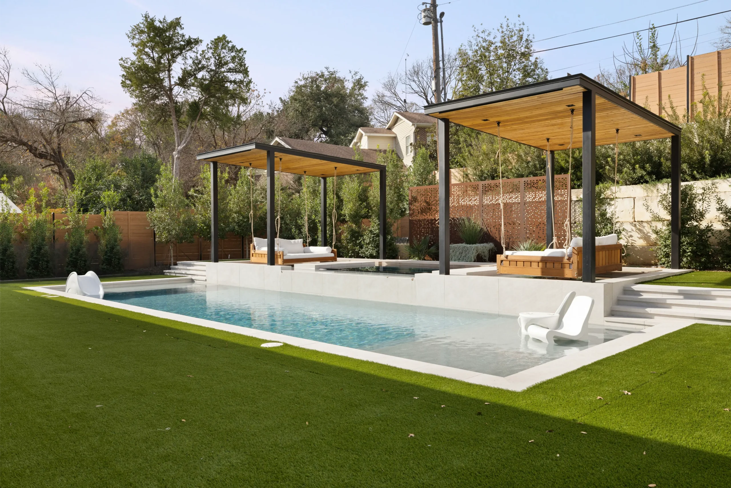
The Safest Exterior Accent Colors to Start With

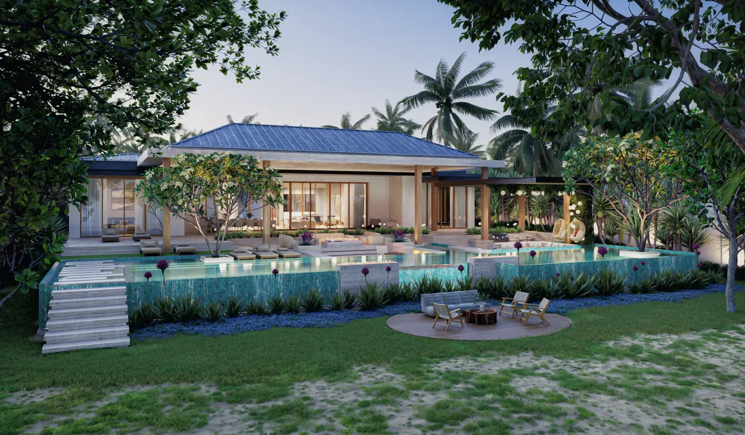
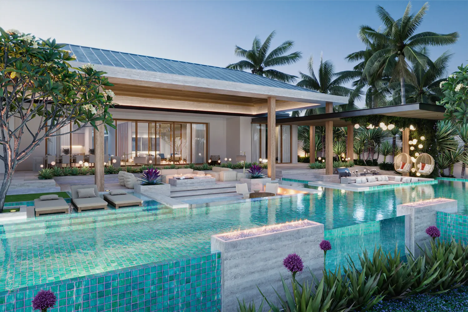
Blue and green are two of the safest colors to incorporate into an exterior color palette.
These colors work especially well as accent tile. Right now, zellige tile is a popular choice because it offers so much variation in tone and texture. You can find shades of blue and green that work for a wide range of styles, whether you are going for a Tulum-inspired look or something more Mediterranean or globally influenced.
Because blue and green are found in nature, they tend to feel timeless. While certain shades may feel more popular at the moment, the right tone will not look dated in a few years.
For most people, these are the easiest and safest colors to start with.
Timeless Outdoor Color Ideas Beyond Blue and Green

If you want to take things a step further, there are other colors that also exist naturally and work well outdoors.
Shades of orange, especially rust tones, are a good example. These colors work particularly well in desert environments, where sand and stone already carry warmer, earthy hues.
Yellow is another option. A very pale yellow can work beautifully in a Capri-inspired or coastal yard. A brighter yellow fits well in a Palm Springs-inspired or mid-century modern space.
As with any color, the tone matters more than the color itself.
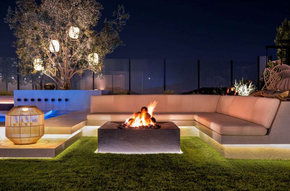
Bold Color Without Long-Term Commitment

If you want to go bold, soft goods are the easiest place to do it.
Adding red cushions to a seating area can have a big impact and still work with almost any color palette. There is a concept often referred to as the unexpected red theory, which suggests that having one red element in a space can work regardless of the surrounding colors.
Whether or not you subscribe to that idea, red can be an effective accent when it is used sparingly.
Because cushions and fabrics are easy to replace, they are a safe way to experiment with color without long-term commitment.
Not every design decision needs to last forever.
Elements like cushions and fabrics will likely be replaced every few years anyway. That makes them ideal for experimenting with color, patterns, or stripes. This is often where personality can come through most naturally.
Even if something feels trendy in the moment, it is not a major commitment when it is easy to update later.
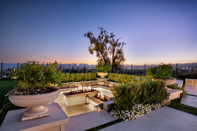
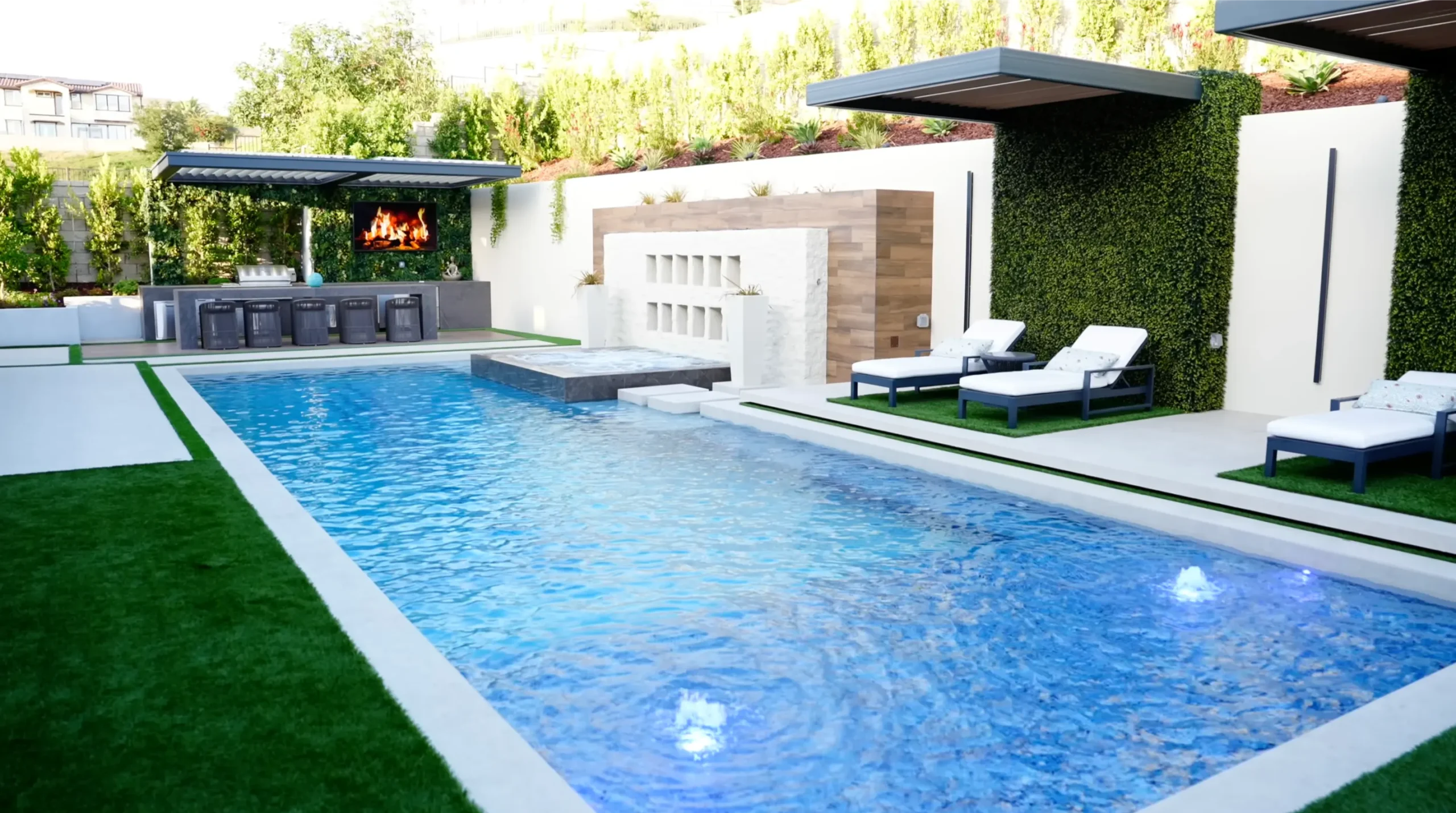
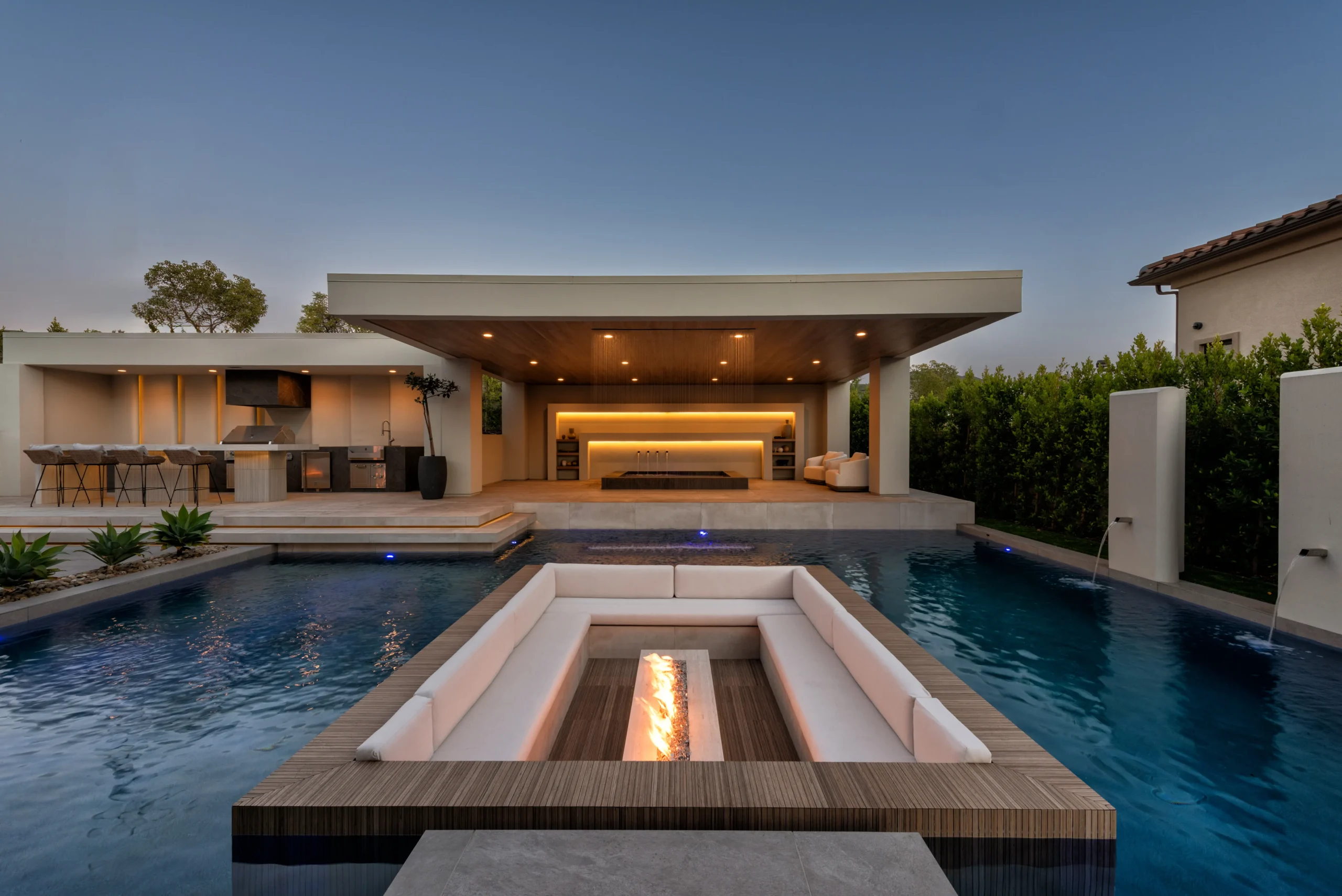
Where to Use Color in a Luxury Outdoor Space

Colored tile works especially well in specific areas.
Using it on a Baja shelf or on the surface of a spa is a subtle way to introduce color that naturally ties into the surrounding pool water. It becomes an accent rather than a focal point, but it still elevates the design.
Outdoor kitchen backsplashes are another great opportunity. You can use colored tile across the entire backsplash or limit it to a portion of the space. Water features also work well with color.
It is important to remember that these structures do not need to be entirely one color. An accent band or small section is often enough.
Final Thoughts on Adding Color to Your Exterior Palette

Most people are cautious when it comes to color, and that is understandable. It can feel overwhelming or like it might be too much.
But when color is used intentionally, it can be the element that separates a space from feeling flat to feeling elevated. It can transform an outdoor area into something that feels more immersive and personal.
Color can elevate an entire outdoor space when it is done right.
If you are ready to work with our team to bring your new yard to life, thoughtful color choices can play a big role in shaping the final result. A neutral palette will always be an option, but it is not the only way to create a luxurious outdoor space.
When used in the right places, color adds depth, warmth, and personality without overwhelming the design.
Not ready to makeover your yard? Check out the free resources we created below – to help you as you start planning your new outdoor space.
👉 Start Your Design Today
📩 Subscribe for Weekly Design Ideas
💭 Download Our Free Inspiration Guide
Do You Need A Pool For Your Yard To Look Luxurious?
You don’t need a pool for your yard to feel luxurious. You also don’t need a ton of outdoor space. In this project, we designed a small-space backyard and courtyard using discoverability, distinct zones, level changes, fire + water, and lighting to completely transform the space.
Frequently Asked Questions
Q: Can color be used in outdoor design without feeling trendy?
A: Yes, when it’s used intentionally. Color can feel timeless outdoors when it’s placed in the right areas and paired with the right materials. Avoiding large, permanent surfaces helps the design age more gracefully.
Q: What are the safest colors to use outdoors?
A: Blues and greens are the easiest place to start. Because they already exist in nature, they tend to feel comfortable outdoors and age more gracefully over time.
Q: Where should color be added first in a yard?
A: Accent areas make the most sense. Pool tile, spa surfaces, outdoor kitchen backsplashes, and water features allow color to show up without overwhelming the overall design.
Q: How do you avoid regretting bold color choices?
A: Use bold color in elements that are easy to change. Cushions and fabrics give you flexibility to experiment without committing to something permanent or expensive to replace.
Behind The Blog

Justin Fox
Founder & Creative Director
Founder Justin Fox grew up with a passion for landscaping. After 15+ years building luxury yards and pools as a licensed contractor, he saw the limits of the design/build model. Homes get detailed, architect-led plans, so why shouldn’t yards? In 2019 he convinced brother Nate Fox to join him and launched Foxterra Design to focus on immersive, luxury outdoor spaces.
Today, Foxterra creates resort-style residential environments for clients worldwide, pairing rigorous planning with bold imagination. Their work has been featured on CBS Sunday Morning, in Architectural Digest, and other leading design outlets.

Nate Fox
Designer
Nate Fox helps shape Foxterra’s creative vision, blending architectural detail with a designer’s eye for proportion and flow. His work redefines the backyard as an extension of modern luxury living.
In recent features, Nate’s perspective has been quoted across leading design publications, including Homes & Gardens and Luxury Pools + Outdoor Living, where he shares practical, design-forward guidance on everything from integrating sculptural moments and sightlines to creating “living wall” effects that soften hard architecture and make compact spaces feel more expansive.
For this story, Nate explores how introducing color in subtle, strategic ways can add depth and personality to an exterior without overwhelming the design or sacrificing a timeless feel.